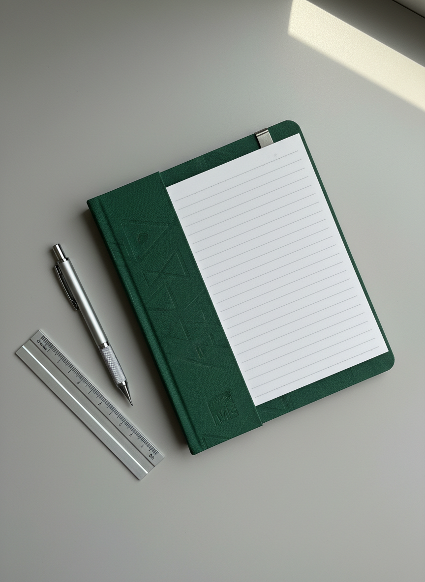
レビュー方針

「お試しで買った物の備忘録」は、気になった商品を実際に購入し、その使用感を率直に残していく個人ブログです。星の数や点数ではなく、「どんな人に向いているか」「どんな人には向かないか」を中心に書いています。提供品やタイアップの場合も、良い点だけでなく気になった点も必ず記載し、読者よりもメーカーを優先しないことをルールにしています。過去の自分が読み返しても判断しやすいように、サイズ感、使い勝手、耐久性、コスパなどの観点をできるだけ具体的に言葉にします。ここで書いているのはあくまで一個人の感想ですが、その分、等身大のレビューとして参考にしてもらえればと思います。

A close-up photographic scene of a newly purchased stationery set on a smooth, light gray desk surface, featuring a high-quality notebook with a textured cover, a precise mechanical pencil, and a compact ruler arranged in an intentional but natural layout. The notebook is slightly open to reveal clean, lined pages with no writing. Morning daylight from a nearby window softly grazes the objects from the right, creating fine highlights on metal clips and subtle shadows along embossed edges. Shot from directly above in a flat-lay style with sharp focus throughout, the composition feels clean and organized, reflecting a professional, review-oriented mindset. The atmosphere is quiet and contemplative, suitable for a blog post evaluating usability, paper feel, and design of practical everyday items bought out of curiosity.
A compact home office setup where a recently purchased productivity item is being demonstrated, such as a wireless keyboard or desk organizer, arranged on a matte-finished wooden desk beside a slim laptop. Cables are neatly routed, and small personal touches like a closed notebook and a muted-color mug are present, all carefully positioned to avoid any human presence. Late afternoon natural light enters from the left, casting long, soft shadows and a gentle warmth across the scene. The image is captured in photographic realism from a slightly elevated, three-quarter angle, using a shallow depth of field so the featured product is razor sharp and surrounding objects subtly blurred. The mood is focused and efficient, conveying the feel of a serious, professional product review environment where tools are objectively tested during actual work.

このブログについて

このブログでは、Amazonで気になって購入した商品の記録を、自分用の備忘録として残しています。購入前に気になったポイント、実際に使ってみて感じた良い点・イマイチな点をなるべく正直にまとめています。専門家のレビューではありませんが、一般ユーザー目線で「買ってよかったかどうか」を冷静に書くことを心がけています。写真はできるだけ実物をそのまま撮影し、過度な加工は行いません。広告やPR商品がある場合は、必ずその旨を明記します。自分の次の買い物の参考に、そしてどこかの誰かの買い物のヒントになればうれしいです。

紹介

よく読む記事

アクセスの多いレビューや、自分でも特に買ってよかったと感じている商品レビューをまとめました。キッチン用品やガジェット、日用品など、カテゴリごとに分けているので、気になる分野から読み進めてみてください。同じような商品で迷っているときの比較材料にもなると思います。新しく書いた記事の中で反応が大きかったものも、適宜ここに追加していく予定です。

A bathroom shelf or vanity top featuring a newly purchased skincare or personal care item, such as a pump bottle or compact container, with a small amount of product dispensed on a clean ceramic dish nearby to show texture and color. The surrounding space includes neatly arranged, label-abstracted bottles and folded white towels, creating a hygienic, organized setting. Bright, diffused overhead lighting combines with soft window light to produce clear, even illumination, avoiding harsh contrast while revealing the gloss, translucence, or creaminess of the product. The photograph is shot at eye level with a centered composition and moderate depth of field, keeping most elements in focus. The tone is clinical yet approachable, ideal for a professional Japanese review blog discussing first impressions, scent, and usability of newly tried items.